The 2017 Australian Interior Design Awards shortlist has just been announced and, pouring through Australia’s most stylish houses, has us in a makeover kind of mood. The new direction for interiors is simple and sublimely laid back with subtle layers of loveliness to adopt and adapt.
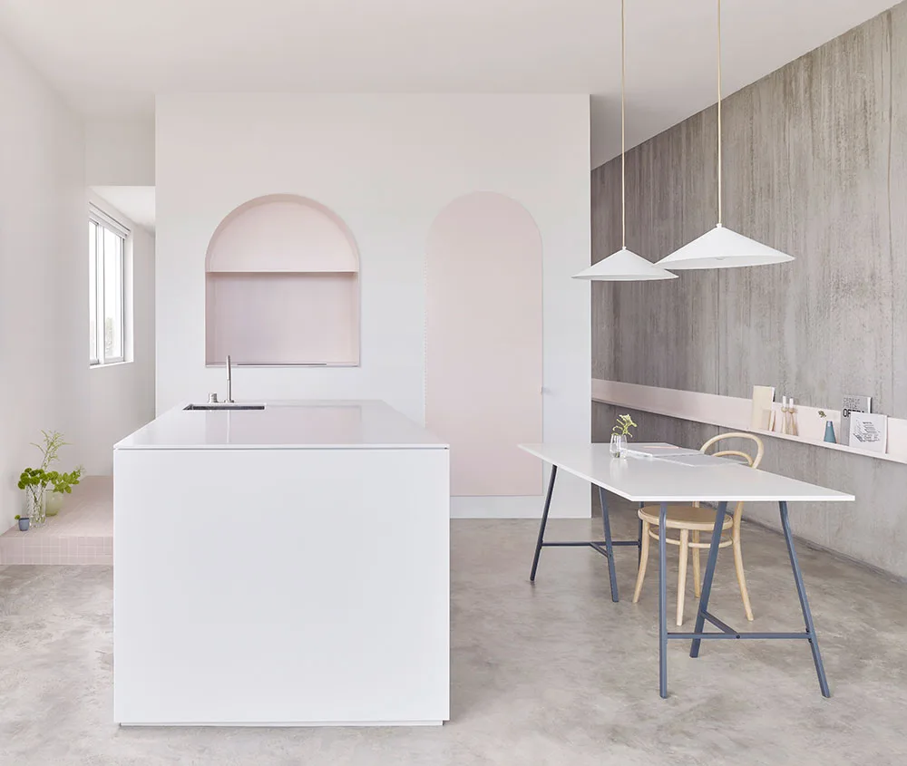
1. Say yes to pink interiors.
Consider this our blessing to really actually go there. Powdery, rosy blush pinks are having a moment – because of the way they play so well with cool grey tones. Pink doesn’t have to be girly either, just follow BoardGrove Architects’ lead and use a pastel hue to offset robust concrete and rigid, puritanical forms.
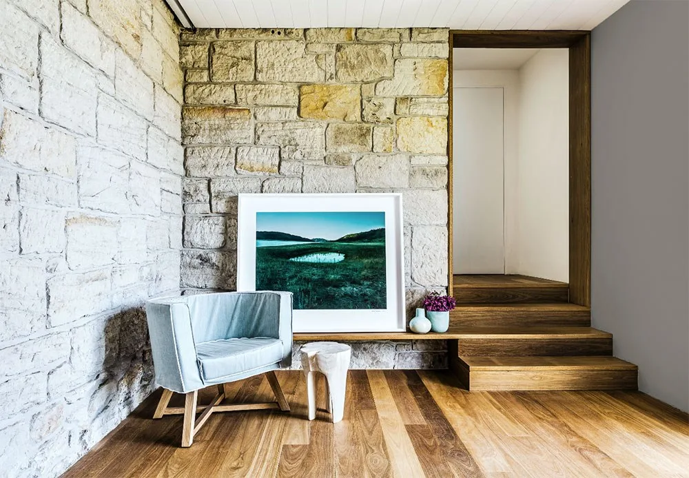
2. Art collections can be cool and casual.
Forget calling in the professional picture hangers, the new way to display art is perched – preferably on a low-lying timber platform and rested against a tactile rock wall such as this one by Madeleine Blanchfield Architects. The look is effortlessly cool and hits an unbuttoned note that makes minimalist perfection just a bit easier to live with.
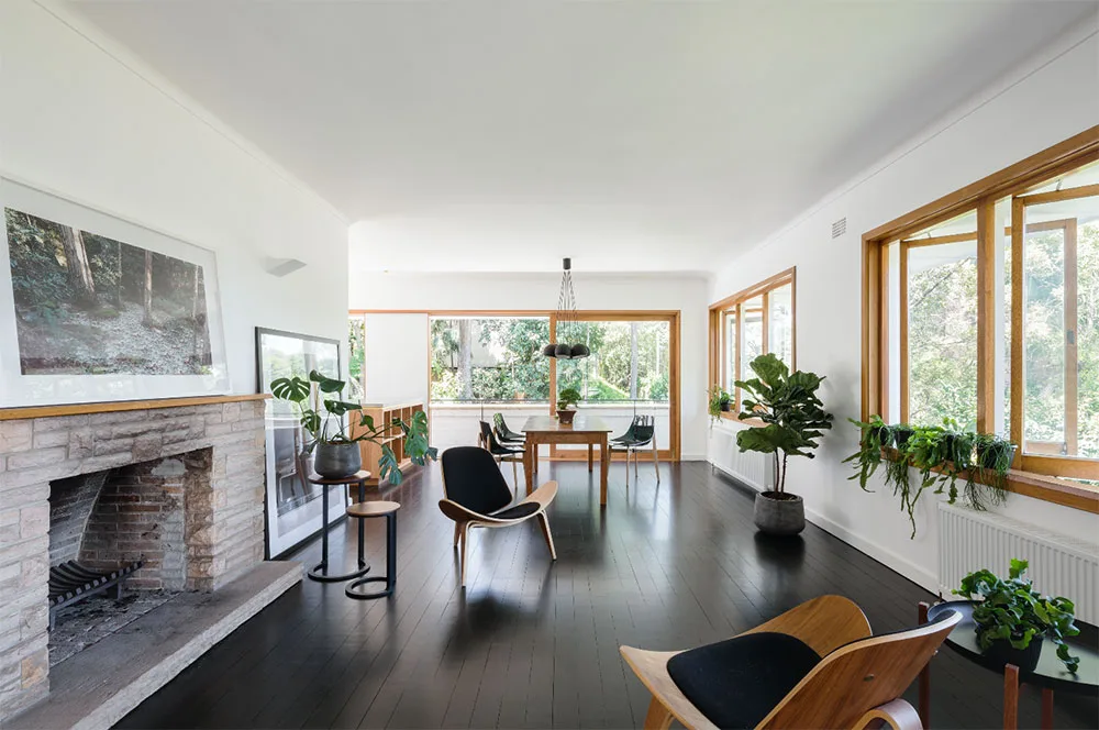
3. Too many plants are not enough.
If this elegant interior by Tribe Studio Architects tells us anything, it’s that houseplants are still having their moment in the sun (and part shade). Why does it work? Plants are layered at varying heights; a fiddle leaf fig on the floor, trailing plants cascading from windowsills and lush monstera plants placed on coffee tables. Take note how especially beautiful the tactile and hand formed pots look in this space. As per usual, it’s all about the vessel.
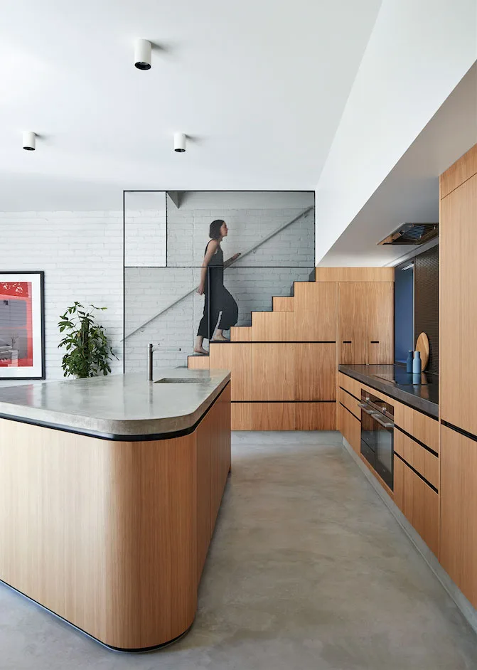
4. Stairs as sculpture
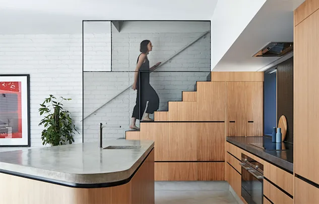
Don’t overlook the humble stair as a medium for some serious house porn. Good design of the inclined variety showcases a refined material mix and, in the case of the Perimeter House by Make Architecture, doubles as kitchen cabinetry.
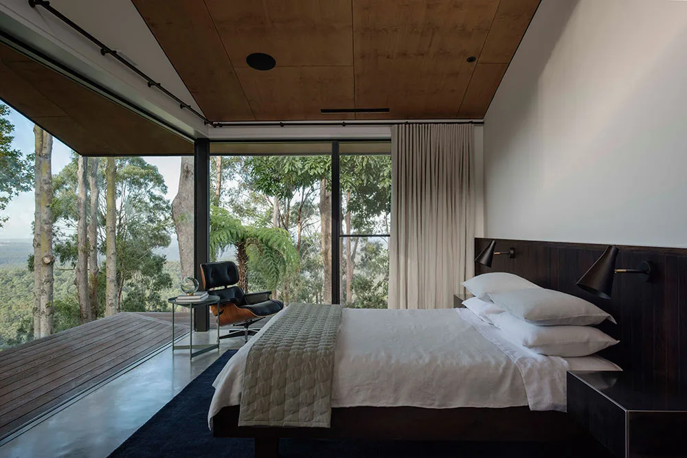
5. Views like this need no complications.
There’s little about Vitale Design’s amazing Quarry House that can be applied to my own everyday-variety life but, in the spirit of honouring beauty and setting some incredibly lofty house goals, it’s still worth decoding it’s mysterious interior charms. The lesson? Sometimes a beautiful backdrop is best supported by natural materials and pared-back simplicity.
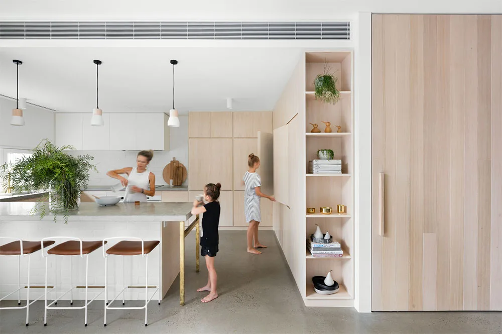
6. A little brass goes a long way.
I love a bit of house jewellery and Halo House by Breathe Architecture gets it exactly right. The brass frame to the kitchen island and a subtle trio of brass votives on the exposed shelves lifts up the otherwise matt timber and marble kitchen without looking blingy.
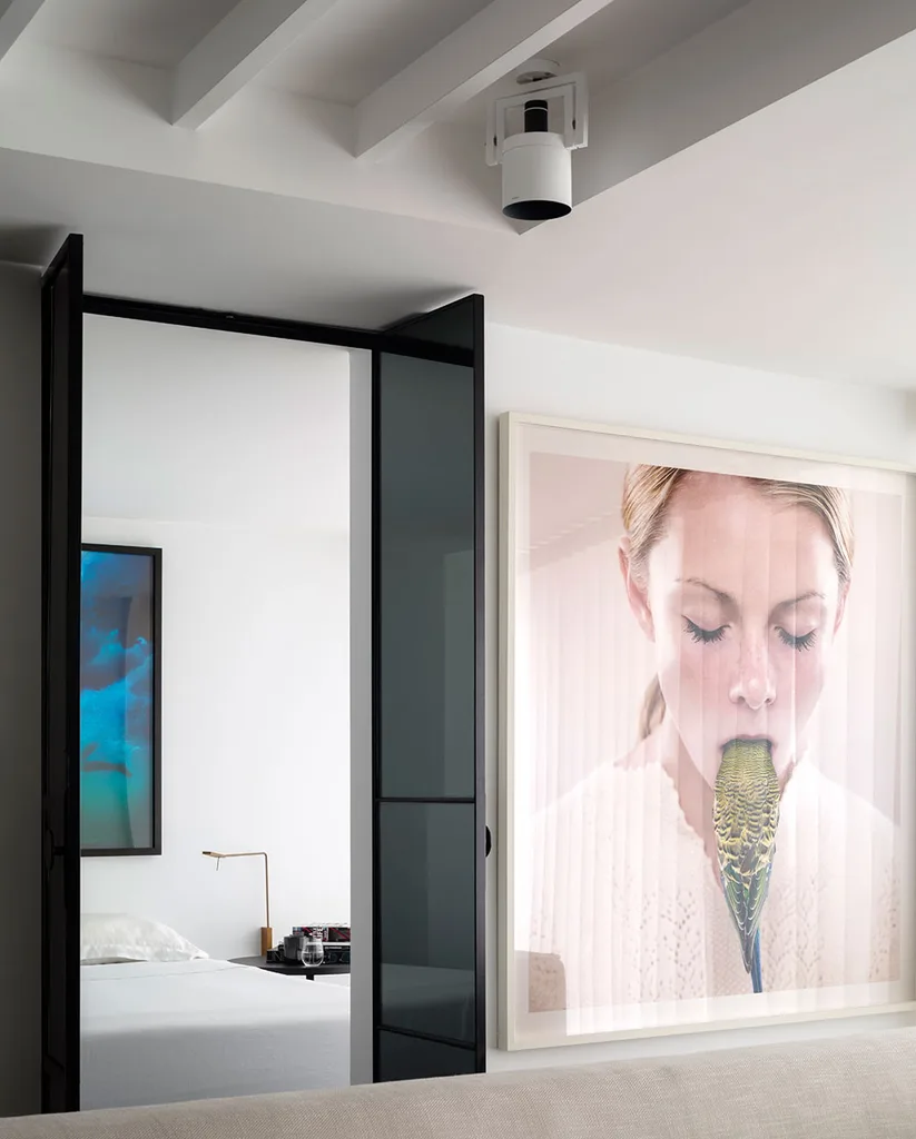
7. Make no apologies
This Bondi apartment by Lawless & Meyerson was designed as a backdrop to its owner’s photographic art. If we can take anything from this live-in personal gallery it’s that if you have a thing for provocative artwork go big, go bold and display it across the entire wall.
